Supermarket Secrets: How Shelf Placement and Packaging Design Affect Allergen Visibility
For food-allergy shoppers, parents, and caregivers, the hardest part of grocery shopping is not always finding a product. It is finding the warning in time. A package can look clean, modern, and reassuring on the front while the important allergen information is tucked away in small print, squeezed into a crowded ingredient panel, or hidden in a place that is easy to miss when you are moving quickly down an aisle. That matters because most shoppers do not inspect every side of a package with equal care, and shelf placement can decide what they notice first.
In a real supermarket, attention is limited, shelves are busy, and labels compete with branding, colors, and price tags. That means allergen visibility is not just a labeling issue. It is also a design issue, a placement issue, and sometimes a country-by-country regulatory issue. The result is simple: two products that are equally risky or equally safe can feel very different to a shopper depending on where the warning is printed and how easy it is to read.
Why Allergen Visibility Matters More Than You Think
Allergen information is only helpful if shoppers can actually see and interpret it quickly. Research shows that among U.S. consumers, 83% report reading food labels before purchasing, but what they prioritize is revealing. Expiration date comes first, followed by ingredients, health claims, allergen warnings, and country of origin. In other words, even when people do read labels, allergen information is not always the first thing they look for. Source: https://www.nsf.org/news/americans-demand-greater-clarity-standardization-food-labeling
That pattern becomes even more important for families managing allergies or sensitivities. One report found that 76% of households with someone having an allergy or sensitivity say they read labels all or most of the time, compared with 58% of shoppers reading labels that often for a new product overall. Health-focused shoppers are even more attentive, with 87% saying they read labels all or most of the time. Source: https://www.supermarketnews.com/grocery-trends-data/most-health-focused-shoppers-read-labels-before-they-buy-report
The takeaway is not that people do not care. It is that attention is selective. In a busy aisle, the safest product is not necessarily the one with the clearest ingredients. It is the one whose allergen information can be located, recognized, and trusted before the item goes into the cart.
How Shoppers Actually Scan Packaging in the Aisle
Most people do not read packaging like a legal document. They scan. They look at the front first, often while holding the item at arm’s length or while comparing it with other products nearby. Eye-tracking research supports that behavior. In one study, 63% of adults viewed a front-of-package label versus 42% who viewed the Nutrition Facts panel, and when front labeling was made easier to interpret, front-label viewing rose to 95%. Source: https://healthyeatingresearch.org/research/nutrition-label-viewing-during-a-food-selection-task-front-of-package-labels-vs-nutrition-facts-labels
That focus on the front is not just a lab finding. Observational research across six product categories found that only about 12% of consumers looked at the back or side of the package before choosing a product. Most decisions were made from what was visible on the front. Source: https://pmc.ncbi.nlm.nih.gov/articles/PMC4376393/
For allergy shoppers, that creates a real problem. The front may be designed to build trust, signal flavor, or suggest healthfulness, while the allergen statement is somewhere else entirely. If a shopper is in a hurry, distracted by children, or trying to compare several similar items, the warning on the back may never be seen. That is why packaging layout matters just as much as wording.
The Design Choices That Make Allergen Warnings Easy to Miss
A warning can be technically present and still practically invisible. Research on allergen declarations consistently points to the same design barriers: low contrast, small font size, crowded ingredient panels, and precautionary statements such as “may contain” being squeezed into tight areas. These design choices reduce both visibility and understanding. Consumers often prefer allergen summaries or highlighted declarations because they stand out more clearly. Source: https://infoalimentario.com/wp-content/uploads/2021/03/fsa-and-fsanz-consumers-and-allergen-labelling-literature-review-of-consumer-response-to-allergen-declarations-and-precautionary-allergen-labelling-revised.pdf
Studies of “may contain” labeling add another layer. Respondents frequently say the type size is so small that it harms legibility, and the problem is often not the font itself but the scale and contrast. If the warning sits inside a block of dense text, or if it is hidden in a fold where the package bends, shoppers can overlook it even when they are actively searching. Source: https://allergyaction.org/wp-content/uploads/2017/09/AC-May-contain-report-maycontainreport.pdf
This is where contrast becomes crucial. U.S. guidance requires allergen declarations to be clearly distinguishable and in distinct contrast with the rest of the ingredient text, and the “Contains” statement must use bold or otherwise visually distinct typeface. That is not a cosmetic preference. It is a readability safeguard. Source: https://fpisolutions.org/fpi_blog/biblioteca/biblioteca_files/98-food-industry-guide-to-allergen-management-and-labelling-rlXeLG2J96.pdf
Accessibility standards point in the same direction. WCAG contrast guidance suggests at least 4.5:1 contrast for normal text and at least 3:1 for large or bold text. While those rules were created for digital accessibility, the principle is highly relevant for packaging too: if the warning does not stand out from the background, the message is harder to process quickly. Source: https://help.nfc.usda.gov/publications/Accessibility_Test_Procedure/67539.htm
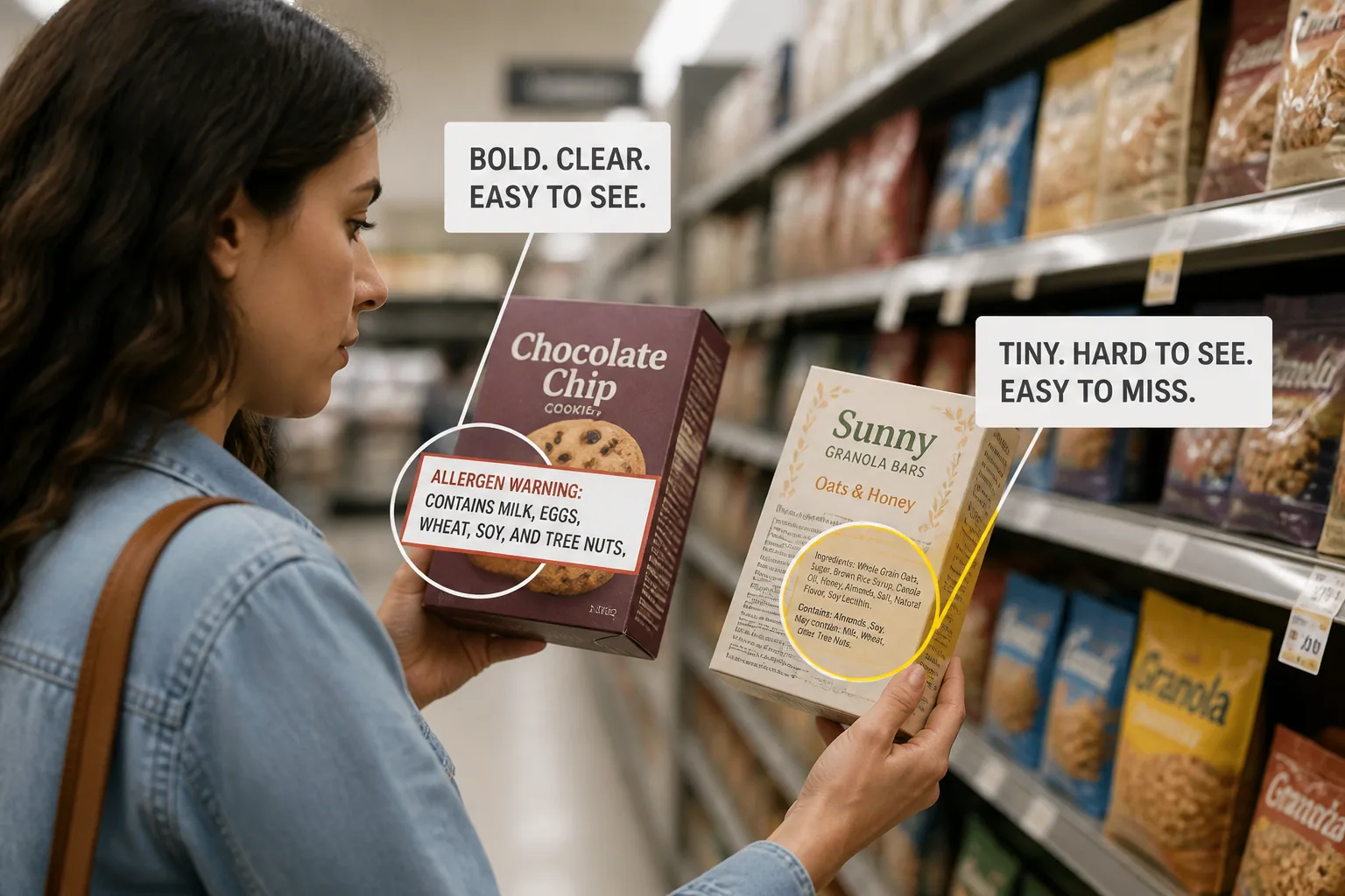
Red Flag Labels vs Hidden Warnings: Real-World Examples
The best allergen labels are not subtle. They usually separate the warning from the rest of the text, make the key allergen easy to find, and avoid forcing the shopper to decode a dense paragraph under pressure. A clear “Contains: milk, soy” statement in bold, placed where a shopper naturally expects it, is far more effective than a tiny note buried after a long list of ingredients.
By contrast, hidden warnings often share the same patterns. They are low contrast, positioned near the bottom of the panel, tucked into a folded edge, or written in a type size that disappears when the package is curved or crinkled. That kind of presentation is especially risky for people who are scanning quickly or comparing multiple products.
Warning design research outside the allergen world reaches a similar conclusion. Eye-tracking studies on product warnings show that when warnings are placed higher on the package and include visual cues like color, borders, or pictorial elements, people locate and recognize them faster. The message is not complicated: the more a warning looks like a warning, the more likely it is to be noticed. Source: Kenneth R. Laughery, Stephen L. Young, An Eye Scan Analysis of Accessing Product Warning Information, https://journals.sagepub.com/doi/abs/10.1518/107118191786754707
For allergy management, that difference can be the line between a product that gets safely rejected and one that is mistakenly assumed to be fine. The challenge is that packaging often markets confidence while warnings quietly compete for attention.
How Shelf Placement Changes What Gets Noticed First
Shelf placement affects visibility before a shopper even touches the package. Products placed at eye level are more likely to be noticed, while items on lower shelves may be glanced over quickly or viewed from awkward angles. A warning printed on the front may still be missed if the package is angled away, crowded by neighboring products, or partially blocked by shelf rails and price tags.
This matters because shelf shopping is not a clean, controlled reading environment. People bend, turn, and compare products in motion. They may see one front label clearly and another only from the side. They may notice branding and color first, then decide the product looks familiar enough to pick up. If allergen information is only on a side panel, it may not enter the decision at all until later, if at all.
Shelf placement also interacts with packaging shape. Tall cartons, curved bottles, resealable pouches, and wide jars all present different surfaces to the shopper. A warning that is legible on a flat label can become difficult to read once the package is curved, glossy, or partially obscured by a hand. That is one reason why shoppers benefit from slowing down at least long enough to check the exact allergen statement, not just the front of the pack.
Why Allergen Labeling Varies Across Brands and Countries
One of the most confusing realities for allergy shoppers is that labeling is not perfectly consistent. Different brands may choose different wording, different layouts, and different levels of prominence for the same type of warning. Some use a bold “Contains” line. Others place allergen references in the ingredients list. Some add precautionary statements, while others keep them minimal or use different phrasing altogether.
Country differences make the situation even more complicated. Regulatory expectations, language conventions, and packaging norms vary, so a shopper traveling abroad or buying imported foods may encounter a label that looks familiar but works differently. What is obvious in one market may be tucked away in another. That is why relying on brand recognition alone is risky.
For caregivers and allergy shoppers, consistency would be ideal. But until labeling becomes more standardized, the safest approach is to assume that every package needs a fresh check. Even products that look similar from one store visit to the next can change ingredients, suppliers, or warning placement.
Fast Label-Checking Tips for Food-Allergy Shoppers and Caregivers
When time is short, the goal is not to become a label expert. It is to build a fast, repeatable routine that works under real shopping conditions. Start with the front of the package, but do not stop there. Look for a clear allergen statement, then scan the ingredients list for the specific allergen names you are avoiding. If the package mentions traces, shared equipment, or “may contain” language, treat that as a serious signal to review the product carefully.
A few habits can make a big difference. Keep a short list of the exact allergen terms that matter to your household, including common aliases and related ingredients. Check labels every time, even for familiar products, because formulations can change without much fanfare. If the print is small or the wording is crowded, turn the package under better light and read the full panel instead of guessing from the front.
It also helps to be skeptical of front-of-pack claims that sound reassuring. Words like natural, clean, high protein, or plant-based do not tell you whether a product is safe for an allergy. They are marketing cues, not allergen guarantees. The real answer is in the allergen declaration and ingredient list.
For families doing frequent shopping, tools that reduce the amount of manual reading can save time and lower stress. Bokha: Food Allergy Scanner App, available for iOS and Android, lets you scan product barcodes and discover allergens in less than a second, including 13 allergens, traces, and additives. It can be especially useful when label design makes information harder to spot in the aisle: https://findthe.app/bokha
How Bokha’s Scanner Uses Packaging Awareness to Help Spot Allergens
Bokha is helpful because it is built around a simple truth: not every shopper can reliably extract warning information from every package, every time. Some labels are clear, but others are visually cluttered, inconsistent, or easy to miss in a hurry. By scanning the barcode, Bokha helps users get to the relevant allergen information faster than manually hunting through small print.
That matters in a supermarket setting where attention is split and shelf placement shapes what gets noticed first. If a product’s allergen warning is hidden, tiny, or buried in a crowded panel, a scanner can act as a second layer of protection. It does not replace careful reading, but it can reduce the chance that a shopper overlooks a detail because of poor packaging design or bad lighting.
The app is designed to detect 13 allergens, including lactose, gluten, peanut, egg, soy, fish, shellfish, tree nuts, wheat, mustard, celery, mint, and sulphites, along with traces and additives such as colorants and preservatives. For families who need to move quickly and still make cautious decisions, that combination of speed and breadth can make the shopping trip less stressful and more reliable.
What Safer, Smarter Allergen Packaging Should Look Like
Safer allergen packaging should be easy to read at a glance, not just technically compliant. That means clear contrast, larger type, uncluttered placement, and a warning structure that makes the allergen impossible to overlook. It also means placing allergen information where shoppers naturally look, instead of assuming they will search every side of the package with equal care.
The most effective designs are straightforward. They use bold labels, separate allergen statements from dense ingredient lists, avoid tiny type in awkward folds, and keep the message visually distinct from marketing copy. When possible, they should be consistent across product lines and markets so that shoppers do not have to relearn the format every time they buy a new brand.
Better packaging would also acknowledge real shopping behavior. People scan quickly, compare many items, and often focus on the front first. So allergen information should be designed for that reality, not for an idealized reading experience. If a warning can be found faster, understood faster, and trusted faster, it is doing its job.
Until more products follow that standard, food-allergy shoppers and caregivers have to combine vigilance with practical tools. Read carefully, trust clear labeling over implied safety, and use scanning support when packaging makes the job harder than it should be. In the grocery aisle, visibility is safety.